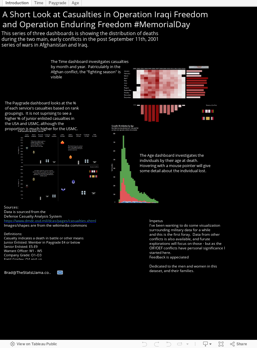
Below is a visualization that I did in order to look at casualties during Operation Iraqi Freedom and Operation Enduring Freedom. For best results, scroll down and use the full screen button -- and note that there are 4 tabs.
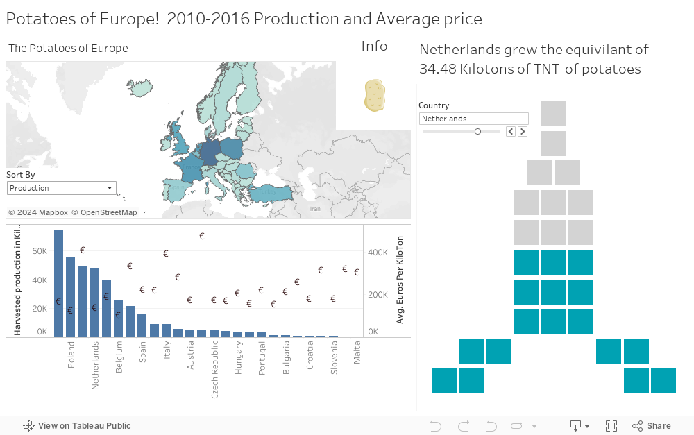
This viz was also part of the #MakeoverMonday project dealing with the amount of potatoes produced around Europe. The data being in kilotons made me think or nuclear weapons - and thus the nuclear waffle chart was born.
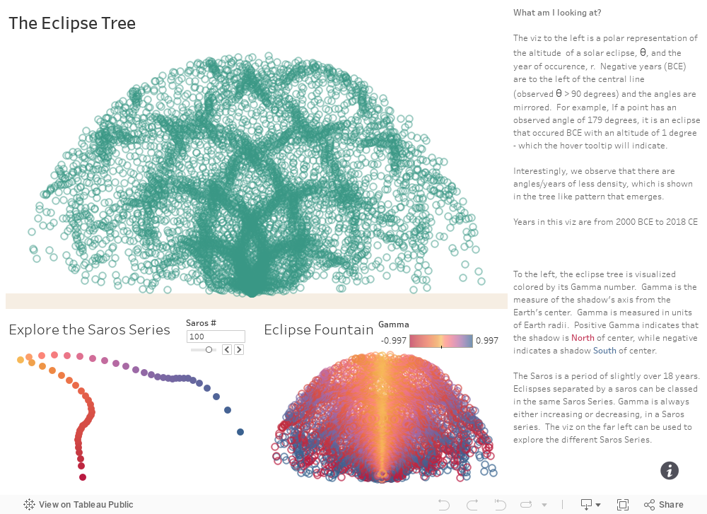
Here is a fun viz done with eclipse data from NASA as part of #MakeoverMonday . I was exploring the data and an interesting pattern appeared.
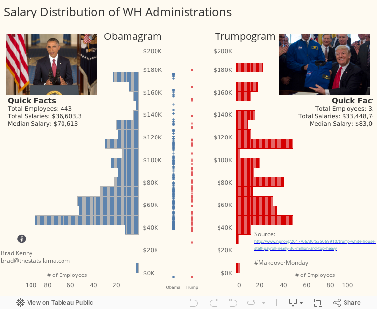
Here we have a dot plot / histogram of White House Salaries - done as part of the #MakeoverMonday project.
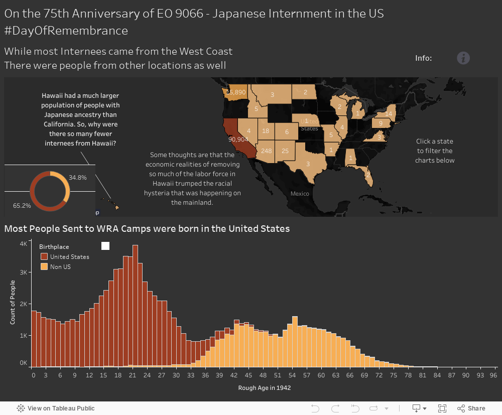
This one explores some data around the internment of people of Japanese decent during WWII in the U.S. Part of #DayofRemembrance
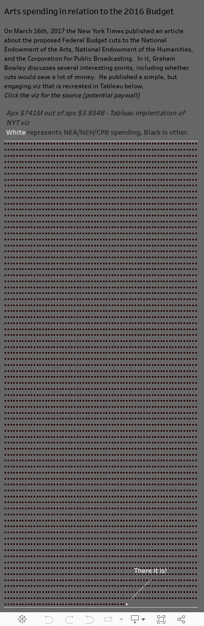
This viz is a sort of waffle chart recreation of a New York Times graphic looking at the % of the budget that the Arts take up. Hint, it's not very much.
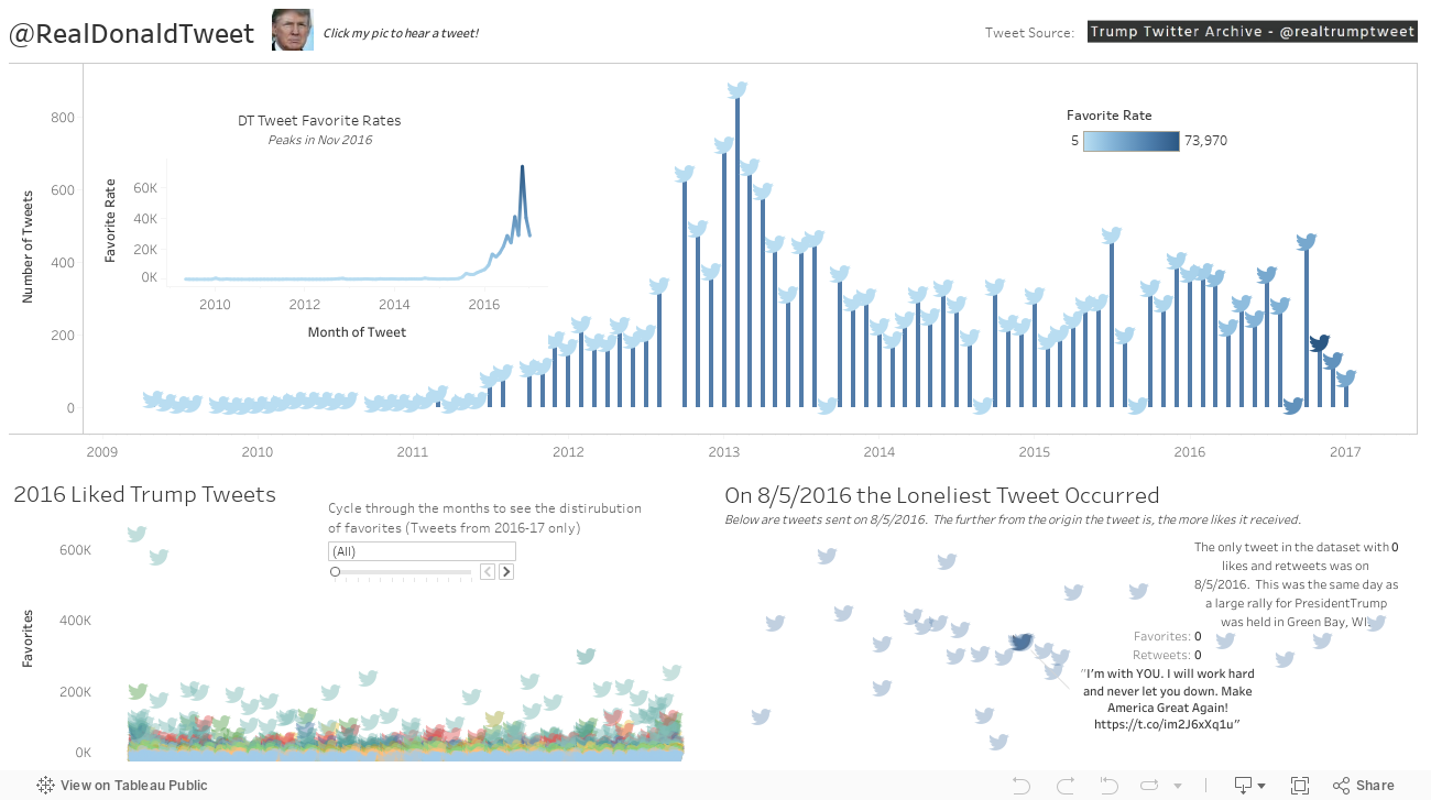
Part of a #MakeoverMonday was to look at Donald Trump's tweets. I like the overall aesthetic of this viz, even though it wasn't designed to fit in the column here. Hit the foll screen button to see its glory!